

Preventative care is incredibly important for maintaining health, staying up to date on vaccinations and catching larger health issues early on. Maintaining a consistent annual calendar for preventative care can be hard for individuals and families.
For this project, I set out to uncover users’ problems surrounding preventative care and create a solution that helped solve these problems within a mobile first responsive website design. The result was a mobile-first design that allows users to track and manage their preventative care schedules for multiple family members in one location.
To better understand users needs and problems, I sent out an initial survey asking questions based around “Taking Care Of One’s” Health. 61% Of Respondents Chose Preventative Care Management As The Topic That Would Benefit Them The Most.
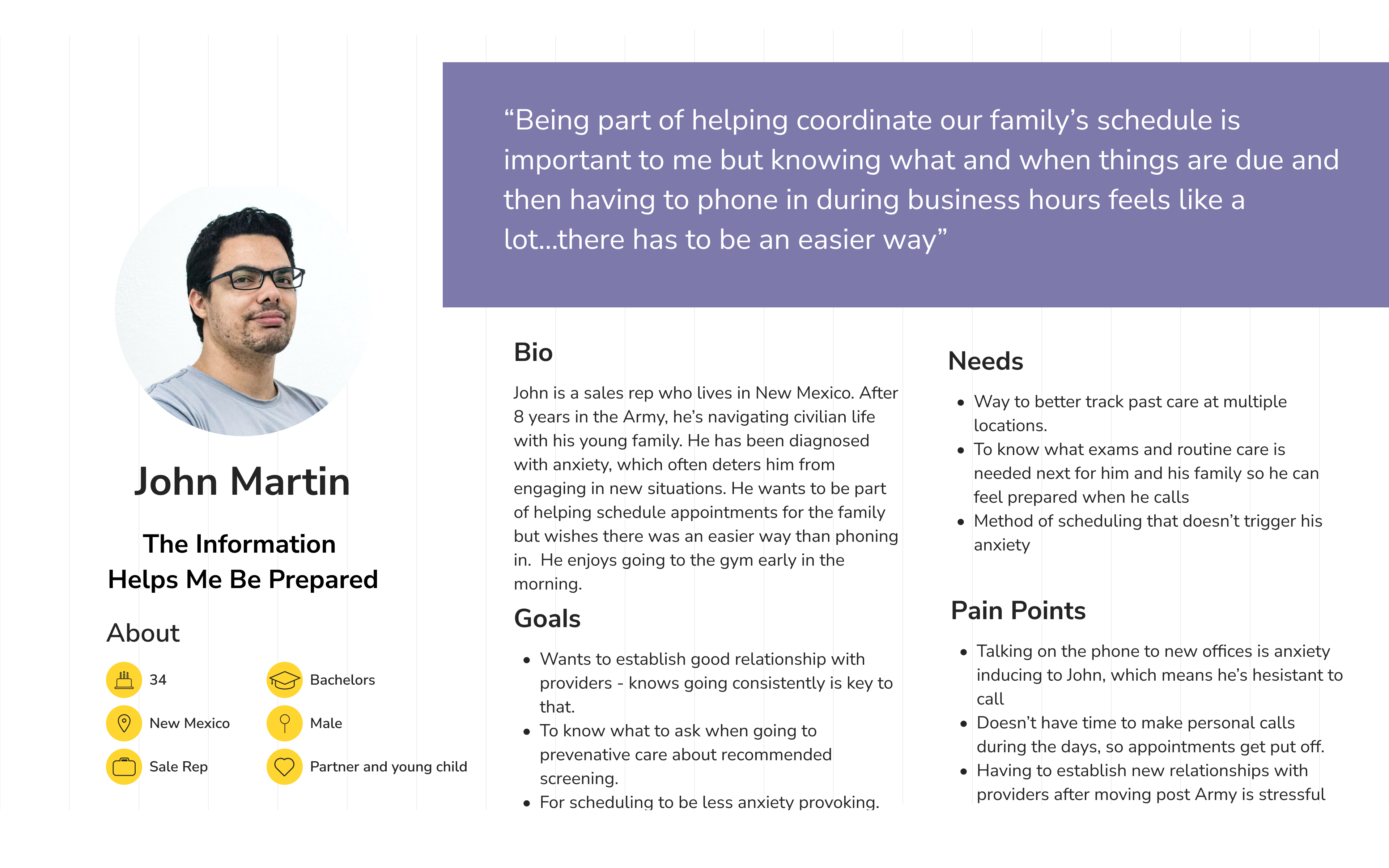
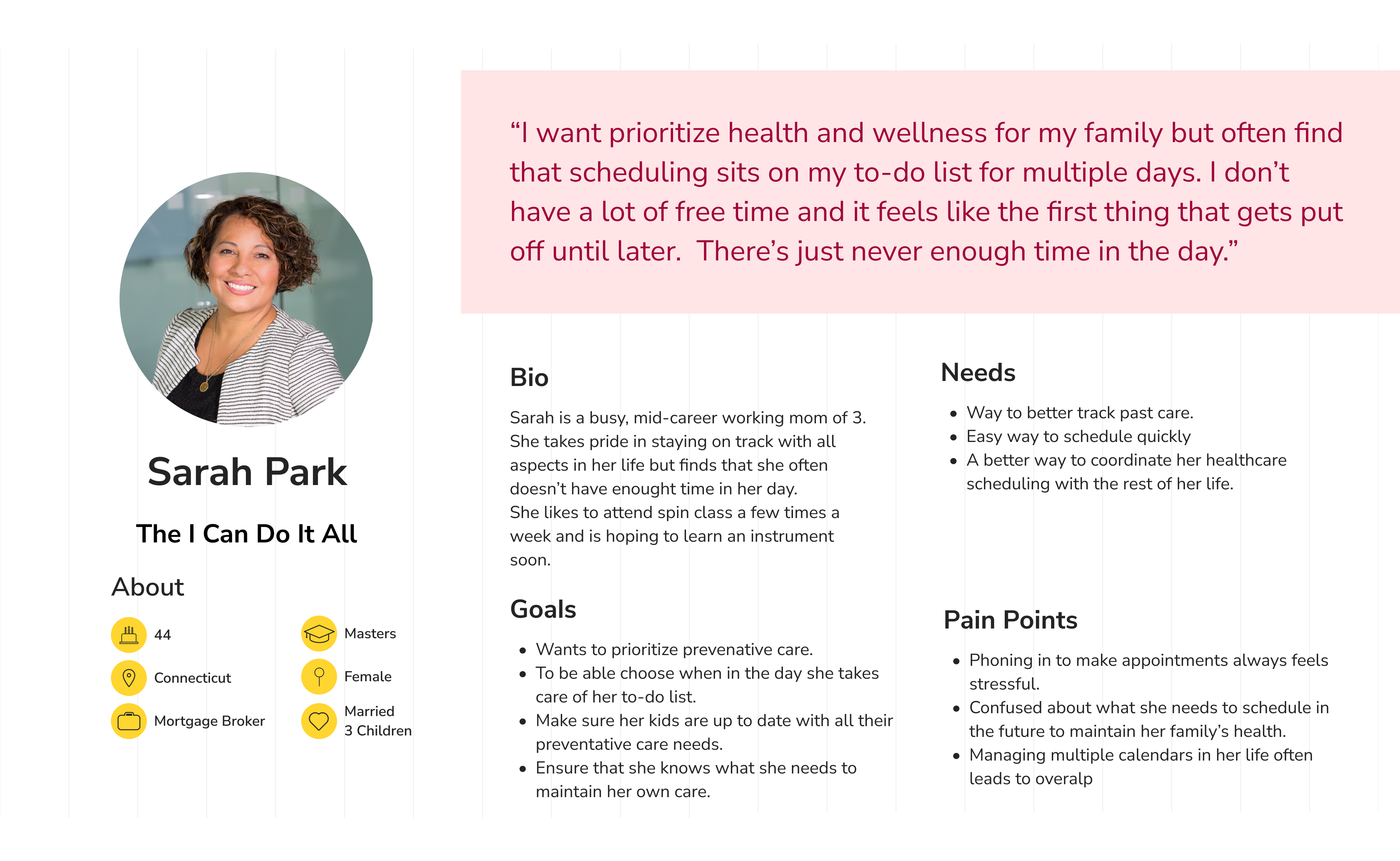
From there, I interviewed 7 individuals via Zoom over the course of 3 days who currently use preventative care, manage their family’s preventative care, and/or don’t participate in routine preventative care, but know they “should”.
“I would prefer tools that help with like "it's been a while since you've been to the dentist maybe go do that" or "hey based on your insurances these are the providers in your network."
- Survey Respondent
“Would love reminders on when to book appointments for me and my family - physicals, dentists, etc. and then making it easy to actually schedule without having to call in.”
- Survey Respondent
“It's important to get to the doctor, get to the dentist, have our annual checkups and really take the time to do that. I think our greatest challenge is finding time to think ahead”
- Beth Age 40, married with 2 kids
“I need to call them and be like, ‘Hey, can I just get like, can you just check under the hood for me just to make sure everything's still working okay?’”
- Ben Age 45, married with 2 kids


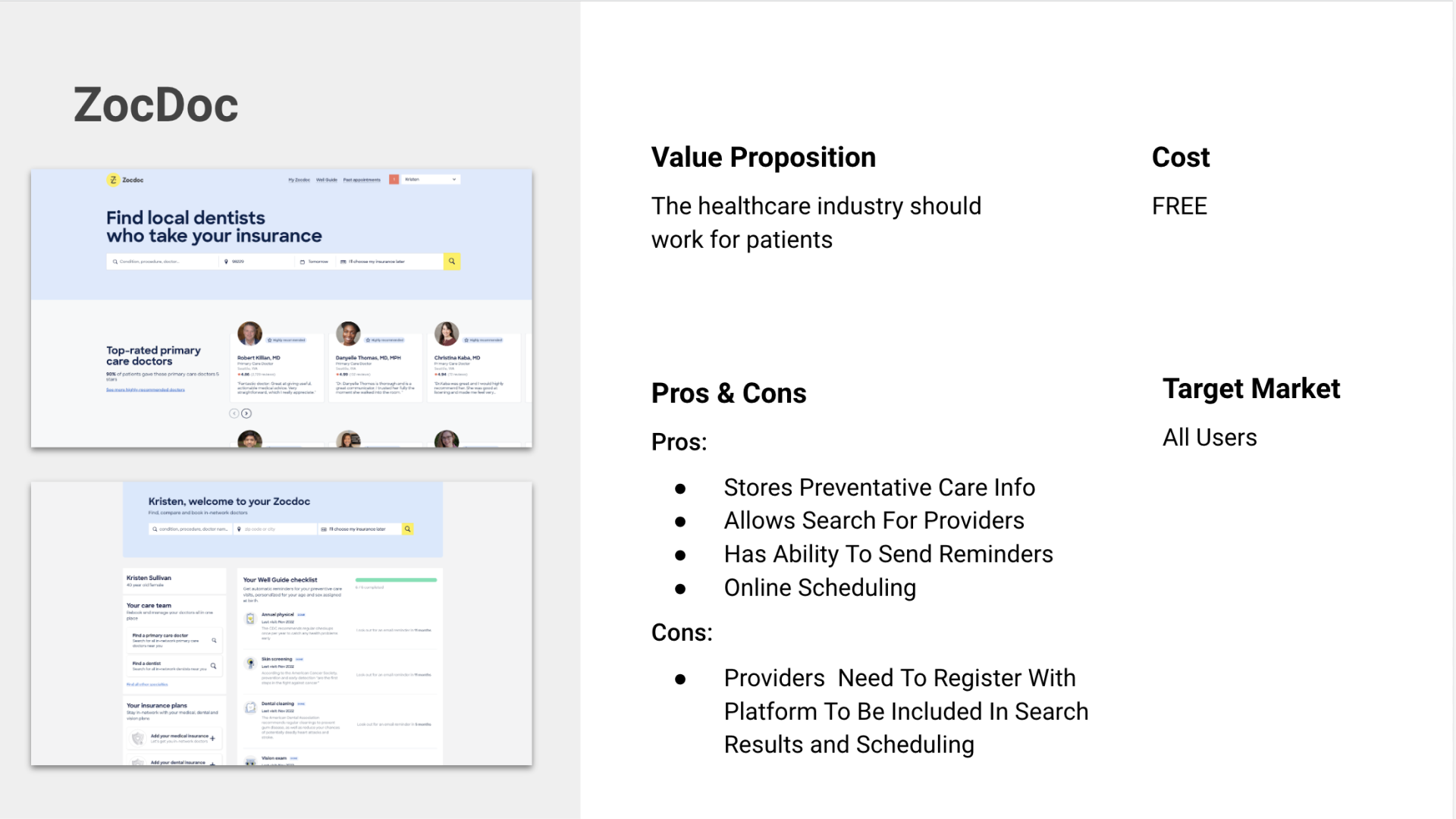


For the competitive analysis I looked at three primary competitors, Apple Health, ZocDoc, OneMedical, and Yohana, a secondary competitor.
What I found was that while products existed that offered ways to manage care scheduling, they were very rigid based on the fact that providers need to be signed up with the service to allow for users to track their care schedules. This limited users ability to use them to track all of their care in one location.
Key takeaways from my research were that users had general idea of their preventative care scheduling routine but had a hard time keeping track of it and remember to stay consistent with it. While there were options available on the market to help with scheduling, many products lacked flexibility for individual user needs and required users to track care across various products.
The two personas I created focused on two distinct user groups to make sure that I was solving the challenge of managing preventative care scheduling for a range of users based on my interviews. Persona 1 was created based on my interviews to focus on busy working moms who also generally take on the responsibility of household scheduling. Persona 2 was created to reflect user I spoke with who like to be involved with scheduling and benefit having as much information on hand as possible.
During my interviews, many of the individuals talked about how they generally keep track of care scheduling in their heads based around annual calendars and life events. Many of them noted that their current method of keeping track of annual care felt stressful and anxiety producing because of the ramifications of missing scheduling a care event in time, especially in families where there are multiple care schedules.

The feature set focus on the dashboard and account creation since this was a new product and getting those features tested was important to show if this product was useful and flexible for users. The highlighted features are all part of the dashboard and were highlighted as a reminder that they were a key focus when creating flows.

Initially I was having trouble getting excited about running a card sort. My initial thought was to have participants sort the sitemap but my pages didn't feel like they had enough depth to actually make that valuable.
Since the I wanted to create a solution that helped users track their individual preventative care schedules I did a card sort looking at people's mental models of what categories care types fall into. These results informed me that there is a wide range of how people categorize care and the product will be more usable by a wider range of users if there is flexibility when entering care types to track.

The first user flow was created to test the profile creation process on the website to make sure it was useful and flexible for users. The second flow tests the process of a user adding an appointment to their account.
I went through a number of iterations on these flows, first to expand, and the simplify them so they didn't have inefficiency in the design of the two tasks. Working through the iterations definitely helped me streamline the flows and have a better mental model of what I was designing.

For my low and mid fidelity wireframes, I focused on creating a simple UI and flows that were intuitive and understandable for users. My goal was making a scheduling product that was easy to understand so that users could focus on using the schedule management features of the product.

I created a design system that was clean and easy to navigate. I wanted the profile colors to stand out in the interface for easy scanning by the user so I chose I simple color palette with only the accent color being bright.


I conducted 5 live usability tests over the course of 2 days via Zoom. This was my favorite part of the project as getting feedback from users was invaluable to the process of creating the best product I could. While I had originally had 8 tests scheduled, two were not able to attend and one was stopped due to technical issues with Figma. This was a good lesson in scheduling more testing sessions than one might need in order to ensure I get enough feedback.
Success metrics for testing successful task completion, easy creation of profile, intuitive process of adding appointment, positive experience with flows and interface.
1. CTA For Adding Appointment 3 out of 5 participants had trouble figuring out how to add an appointment. To address this issue, I changed the look of the "Add" CTA to be more prominent.
2. Profile Icons & Chips The placement of the profile icons was competing with the add CTA, making it confusing to users. I changed the style to chips to make better related to the card and moved it down to directly above the cards to show its relationship to the cards.
3. Care Due Text All participants felt unsure what the heading “Care Due” meant and felt there might be more intuitive wording. This was something that I had been looking to test as I felt that the wording may not have been quite right. I changed it to "Unscheduled" to make it relate better to the "Scheduled" header.


4. Multiple Profiles During the first flow, users were unclear that the product could manage care schedules for multiple profiles. I added a key features section on the homepage and labeled profile text in the profile creation flow to Profile #1 to help users make the connection that there could be multiple since this was a key feature of the product that set it apart from competitors.
5. Care Type Options In the initial flow, I had not built out the functionality to demonstrate the “View More” or “Add Custom Care” for care types. Participants were interested in this and thought it was a great feature to give the user flexibility within the product. Since it is a feature that differentiated the product from competitors, I added more screens to the flow to show the functionality of this in the prototype.
